Instruction-memo for visual ASO

CRO
Aug 25, 2022

RadASO knows everything and more about App Store Optimization. We are happy to share our expertise and you can put these tips into practice to improve your app’s ranking. It's time for useful content, and today we're talking about the Graphic ASO.

Join the open ASO & User Acquisition community on Discord - ASO Busters! Here, engage in insider discussions, share insights, and collaborate with ASO and UA experts. Our channels cover the App Store, Google Play, visual ASO, ASA, UAC, Facebook, and TikTok.

Graphic ASO is the optimization of all graphical elements on an app store page listing. The primary goal of the optimization process is to increase the conversion rate. When a user searches for an app not by inputting a direct brand name but rather by using search terms that relate to its features and functionality, the decision whether to proceed with the download or not ultimately boils down to the app listing's visual representation. In one of our articles that you can find here, we have already listed the reasons why graphical optimization of app listings in the App Store and Google Play is important. So we suggest you give it a read and use it as a guideline when preparing your ASO graphics to ensure the graphical aspect of your app listing is picture-perfect. Ok, let's roll!

Graphics optimization for the App Store

An ASO specialist can help you tweak the following visual components of iOS apps:

  1. Icon.
  2. Screenshots.
  3. Cover (Page artwork).
  4. Video (App preview).
  5. Video banner (Preview poster frame).

Icon

The app's icon is the main visual element that should represent your application's purpose from the first second.

General requirements for the icon:

  1. It should attract attention and be memorable.
  2. The design should be in line with what the app is about and, at the same time, stand out from its competition.
  3. Simplicity and minimalism are the keys to success. Don't overload the icon with small details.
  4. Create a recognizable icon that speaks to the essence of the application.
  5. Test the icon on different backgrounds - not only how it appears in lighter and darker colors but also on various color schemes.
  6. Keep the corners of the icon straight. The system will automatically round them off.
  7. You can use only 1 icon for all locales in the App Store.
  8. Using call-to-action phrases on the icon is prohibited.
  9. Do not write any branding if no one knows it.

App Store icon requirements:

Attribute
Value
Format
PNG
Color space
Display P3 (wide-gamut color), sRGB (color), or Gray Gamma 2.2 (grayscale).
See Color Management.
Layers
Flattened with no transparency
Resolution
Shape
Square with no rounded corners
Attribute
Value
Format
PNG
Color space
Display P3 (wide-gamut color), sRGB (color), or Gray Gamma 2.2 (grayscale).
See Color Management.
Layers
Flattened with no transparency
Resolution
Shape
Square with no rounded corners
Word
Frequency in service
Qimai(China)*
AppTweak
Mobileaction
Appfollow
课程 (course)
5387 (high)
56 (mid)
5 (low)
34 (mid)
外语 (foreign language)
5699 (high)
35 (mid)
5 (low)
34(mid)
播放 (play)
5496 (high)
35 (mid)
5 (low)
35 (mid)
*Search index in China provided by Qimai and based on multidimensional calculations such as search results, downloads and relatable keywords.
App Store
Google Play
1. Icon impact on user choice
Important, but not more than a video with screenshots, as they take up most of the screen
Icon is displayed with several other icons in search results, and therefore it has the greatest impact on the user's choice
2. Icon localization
1 icon for all locales
Can be localized for each country
3. Screenshots quantity, orientation
From 1 to 10, any orientation
From 2 to 8, any orientation
4. Screenshots the most important are the ones that are visible before you start scrolling
  • Vertical screenshots: 3 are visible
  • Horizontal screenshots: only the first one is visible
  • Vertical screenshots: 4 are visible
  • Horizontal screenshots: only the first one is visible
5. Screenshots size
Large — the content is legible
Much smaller — the captions are quite illegible
6. Video quantity
Up to 3
One video that must be uploaded to YouTube
7. Video orientation
Any orientation
Horizontal orientation prioritized
8. Video autoplay
Plays automatically for 30 seconds without sound
You need to click on it to play
9. Application cover
Displayed on the application and developer pages
There is no cover
10. Graphics update
After release only
Whenever

Icon sizes

Each application should have 2 icons:

  1. A larger one is displayed in the App Store:
Device or context
Icon size
iPhone
60x60 pt (180x180 px @3x)
60x60 pt (120x120 px @2x)
iPad Pro
83.5x83.5 pt (167x167 px @2x)
iPad, iPad mini
76x76 pt (152x152 px @2x)
App Store
1024x1024 pt (1024x1024 px @1x)
Source language
Target language
How much longer (+) or shorter (–) the text in the target language is
English
French
21.18%
English
Spanish
19.52%
English
Italian
17.91%
English
Deutsch
16.67%
English
Dutch
13.80%
English
Portuguese (Portugal)
14.29%
English
Portuguese (Brazil)
12.96%
English
Polish
9.33%
English
Russian
9.11%
English
Czech
3.70%
English
Arab
–6.25%
English
Japanese
–39.68%
English
Korean
–44.04%
English
Chinese (Simplified)
–61.97%
English
Chinese (Traditional)
–63.80%
*Search Ads Popularity (SAP)shows the popularity of the search term from 5 to 99.
  1. A smaller one is displayed on the device after installing the application:
Device
Spotlight icon size
Settings icon size
Notification icon size
iPhone
40x40 pt (120x120 px @3x)
29x29 pt (87x87 px @3x)
38x38 pt (114x114 px @3x)
40x40 pt (80x80 px @2x)
29x29 pt (58x58 px @2x)
38x38 pt (76x76 px @2x)
iPad Pro, iPad, iPad mini
40x40 pt (80x80 px @2x)
29x29 pt (58x58 px @2x)
38x38 pt (76x76 px @2x)
Search term
Translation
SAP* English (U.S.)
SAP* English (U.K.)
truck games
games with trucks
62
39
lorry games
games with trucks
32
jail games
prison games
29
8
prison games
prison games
32
24
*Search Ads Popularity (SAP)shows the popularity of the search term from 5 to 99.
Google Play
App Store
What can be tested?
  • Short description
  • Long description
  • Icon
  • Feature graphics
  • Screenshots
  • Videos
  • Screenshots
  • Videos
  • Icon (has to be uploaded to the build*)
Number of simultaneously running tests
5 tests (each test is valid within a single country.

You can choose a default country test (details below): then it will run in all countries where there are no localized graphical or textual materials.
1 test (the test can be immediately extended to all countries where the application is available or opt for specific countries as needed)
The number of test variants that can be tested with the current version in the store
Compared with a maximum of 3 new variants
Can a test be launched while another item is under review?
Yes
No
Mandatory formats for screenshots uploaded to the store
6.5
  • 6.5
  • 5.5
  • 12.9 (if there is an iPad version)
*Build – is a new version of the application. Updating the icon is only possible when updating the application version in the store. In other words, the term "build" refers to a specific version or variant of the application that is ready to be downloaded and installed on the users' devices. It contains all the necessary files and data for users to install and use the application.
More about optimizing graphic elements in the App Store and Google Play can be found in the article 'Graphics in Mobile App Promotion in the App Store and Google Play (ASO) – How to Optimize Graphic Elements.'

Screenshots

Screenshots are the most noticeable graphical elements on the app listing page.

General screenshots requirements in the App Store:

  1. The recommended number of screenshots is between 1 to 10, and the orientation can be both vertical and horizontal.
  2. It’s possible to upload different screenshots for different devices.
  3. Different screenshots can be used for each individual locale.
  4. It is a good practice to show the app's interface or gameplay.
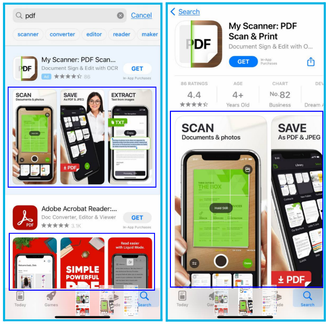
  5. Please note that in the search results, the user sees 1 horizontal screenshot or 3 vertical ones, and on the app listing page, 1.5 vertical screenshots.
  6. Follow Apple's screenshot content policy.

Screen sizes:

Device size or platform
Screenshot size
Requirement
Screenshot source
6.5 inch (iPhone 13 Pro Max, iPhone 12 Pro Max, iPhone 11 Pro Max, iPhone 11, iPhone XS Max, iPhone XR)
1284 x 2778 pixels (portrait)2778 x 1284 pixels (landscape)1242 x 2688 pixels (portrait)2688 x 1242 pixels (landscape)
Required if app runs on iPhone
Upload 6.5-inch screenshots
5.8 inch (iPhone 13 Pro, iPhone 13, iPhone 13 mini, iPhone 12 Pro, iPhone 12, iPhone 12 mini, iPhone 11 Pro, iPhone XS, iPhone X)
1170 x 2532 pixels (portrait)2532 x 1170 pixels (landscape)1125 x 2436 pixels (portrait)2436 x 1125 pixels (landscape)1080 x 2340 (portrait)2340 x 1080 (landscape)
Required if app runs on iPhone and 6.5 inch screenshots are not provided
Default: scaled 6.5-inch screenshotsAlternative: upload 5.8-inch screenshots
5.5 inch (iPhone 8 Plus, iPhone 7 Plus, iPhone 6s Plus)
1242 x 2208 pixels (portrait)2208 x 1242 pixels (landscape)
Required if app runs on iPhone
Upload 5.5-inch screenshots
5.5 inch (iPhone 8 Plus, iPhone 7 Plus, iPhone 6s Plus)
2048 x 2732 pixels (portrait)2732 x 2048 pixels (landscape)
Required if app runs on iPad
Upload 12.9-inch iPad Pro (3rd generation) screenshots
5.5 inch (iPhone 8 Plus, iPhone 7 Plus, iPhone 6s Plus)
2048 x 2732 pixels (portrait)2732 x 2048 pixels (landscape)
Required if app runs on iPad
Upload 12.9-inch iPad Pro (2nd generation) screenshots
Price
Traffic Source (Self Reporting Networks)
Facebook
Google
X (Twitter)
Apple Search Ads
Cohort reports
Impression tracking
Audience segmentation
At extra charge
Custom Dashboards
Custom Reports
At extra charge
Advertisement Cost
DAU/MAU (Stickiness)
Raw Data Export
At extra charge
At extra charge
At extra charge
API Reporting
Search term
Translation
SAP* French
SAP* French (Canada)
soldes
sale
25
5
aubainerie
sale
14
*Search Ads Popularity (SAP)shows the popularity of the search term from 5 to 99.

Cover (Page artwork)

The cover is displayed on the app listing page and the developer's page in the App Store.

In the official cover guidelines, the App Store indicates:

  • The image must be recent and remain relevant for at least 6 months, since it will be problematic to change it.
  • Resolution: 4320 x 1080 pixels.
  • File type: PSD, ZIP.
  • Name: AppName_AppleID_AppStore_Product-DeveloperPage.

Video (App preview)

Video is always displayed before screenshots. Not all publishers choose to include it, though, so the need for its presence must be established with further tests. Practice shows that including a video to demonstrate gameplay has a good effect on conversions as far as video games go, but this is not always the case for regular apps.

Basic video requirements:

  1. For each locale, you can use its own individual video while taking into account that:
  • A video uploaded to the main locale will be displayed in all locales;
  • If a video is placed in a non-primary locale, it will be displayed in this particular locale.
  1. If videos in your app listing are horizontal and vertical screenshots are loaded at the same time, the search engine will display the horizontal video, and it will be placed below the vertical screenshots on the app listing page.
  2. Its duration can vary from 15 to 30 seconds.
  3. It is possible to add up to 3 videos, but according to Splitmetrics, this is not recommended. Data shows that users never watch more than 1 video, and their attention span is roughly 7-11 seconds.
  4. The video needs to showcase interaction with the application interface.
  5. It is forbidden to show commercials, devices, or people with devices.
  6. You should comply with Apple’s video specifications.
  7. Get acquainted with Apple’s tips for creating videos for the App Store preview.

Video banner (Preview poster frame)

An individual frame from the video can be used as a banner - uploading a separate image is not necessary.

You can set up a banner when uploading a video to App Store Connect.

Usually, the video is played automatically, but there are exceptions, and freeze frame helps in the following cases:

  • If the user has disabled automatic video playback in the device settings;
  • If there is a weak internet connection;
  • In energy-saving mode;
  • If the second video is already playing above the feed.

Device
Icon size
iPhone
180px × 180px (60pt × 60pt @3x)
120px × 120px (60pt × 60pt @2x)
iPad Pro
167px × 167px (83.5pt × 83.5pt @2x)
iPad, iPad mini
152px × 152px (76pt × 76pt @2x)
App Store
1024px × 1024px (1024pt × 1024pt @1x)
Icon format
PNG
Color models
sRGB or P3 (see "Color Management")
Layouts
Aligned without transparency
Sizes
Shape
Square without rounded corners
All the current requirements for icons are specified in the specification.

Graphic Optimization for Google Play

An ASO specialist can help you tweak the following visual components of Android apps:

  1. Icon.
  2. Screenshots.
  3. Banner (Feature graphic).
  4. Video.

Icon

In Google Play, as in the App Store, the icon is the app's most visible graphical element.

Note that in search results, a user sees many icons simultaneously. Therefore, your app's icon should somehow stand out from the competition and catch their attention. At the same time, it's a good practice to have it harmonize with other icons that belong in the same category.

The following are Google's official icon properties recommendations:

  1. Image: 32-bit PNG (with alpha channel).
  2. Dimensions: 512 by 512 pixels.
  3. Color space: sRGB.
  4. If the shape is a full square, the system will automatically round off the edges.
  5. Maximum file size: 1024 KB.
  6. You can add your own icon for each locale.
  7. It must meet the Google Play icon design specifications:
  • You cannot use call-to-action phrases that urge the user to download the app or include information about its price or any ongoing discounts;
  • It is prohibited to show the app's rating in any way;
  • The use of information that may mislead the user is not allowed;
  • It is forbidden to show that the app participates in the Play program.

Screenshots

Screenshots in Google Play are significant graphical elements that influence conversions. However, they are only visible on the app listing page - search results do not display them (brand requests are an exception).

  1. You can include 2 to 8 screenshots of any orientation for all supported devices.
  2. You should include at least 4 screenshots for games and applications.
  3. Google does not enforce the usage of strict image dimensions, but it’s a good practice to comply with the recommended specifications:
  • JPEG or 24-bit PNG (no alpha channel);
  • Minimum size: 320 pixels;
  • Maximum size: 3840 pixels.
  1. Screenshots should show the app's interface and demonstrate actual interaction with the application or showcase gameplay.
  2. Google allows stylized screenshots to be shown, but it's recommended to prioritize showing the user interface, at least in the first three screenshots.
  3. You cannot show ratings, reviews, awards, discounts, or promotions. Avoid words like Best, #1, Top, New, Discount, Sale or Million Downloads in the screenshots.
  4. Calls to action about downloading the app, such as Download now, Install now, Play now or Try now are not allowed.

Banner (Feature graphic)The banner is used as a means to stand out from the competition and catch the users' attention.A banner in Google Play is displayed:

  • as the cover if there is a video on the page;
  • in selections, recommendations, collections, including advertising spaces.

Basic banner design requirements:

  1. Respect the size and format of the image specified in the official guidelines from Google:
  • JPEG or 24-bit PNG (no alpha channel);
  • Dimensions: 1024px by 500px.
  1. In the image, try to convey the essence of the application or game and its main value and purpose.
  2. Don't repeat the icon image in the banner to avoid duplication.
  3. Omit small details.
  4. Localize graphics and text.
  5. Avoid text or images that may become irrelevant over time. If you are preparing a banner for a holiday or event, update it in a timely manner.
  6. Use the same or similar color scheme for the icon, screenshots, and banner.

Video

Including a video on the app listing page is not required, but it's a good opportunity to showcase the main features and benefits of your app or game.

Basic video preview requirements:

  1. To add a video, you first need to upload it to Youtube and specify a link to it in the application settings.
  2. Localize your video to display it in different languages worldwide.
  3. The video uploaded to the main locale will be displayed in all other locales unless another link is specified.
  4. Including advertising and monetization in the video is forbidden, and there should be no age restrictions.
  5. Autoplay lasts 30 seconds, but the most important features should be shown in the first 10 seconds to keep the user engaged.
  6. Give preference to videos in landscape orientation, as the video content will be played in a landscape player.
  7. It is advisable to add subtitles so the user can understand what the video is about, even with the sound off.
  8. To record a video from the device's screen, follow these instructions.
Icon format
32-bit PNG (with alpha channel)
Color models
512 х 512 pixels
Layouts
1024 КБ
Sizes
square, without rounding and shadows (Google automatically rounds the corners and adds shadows)
All the current requirements are specified in the specification.

Tweaking the graphical representation of an app is just as important as text optimization. Graphical elements should always stand out to be memorable and incentivize the user to download the app, helping you reach the desired conversion rate.

For the best results, follow the App Store and Google Play instructions, study your competitors' approaches, get inspired by new ideas, follow the trends, and always stay at the top of your game, not only based on the number of impressions but also in terms of installs and purchases.

Home
Up