
Looking for a way to boost conversion rates without overspending on ads? CPP and CSL custom pages are among the most underrated tools that many app owners still overlook.
In this article, I’ll explore clear examples of custom page implementations, including those by the RadASO team, and show how using these pages impacts app conversion rates and organic traffic.

Custom Store Listings (Google Play) and Custom Product Pages (App Store) are alternative versions of an app’s listing page that are tailored to different user scenarios. Instead of relying on a single, one-size-fits-all storefront, you can create multiple pages designed for specific search terms, audiences, countries, ad campaigns, and stages of the user journey.
Instead of landing on a “generic” app page, users see a version that best matches their context and expectations.
Detailed setup instructions and tool limitations are covered in separate guides: the Google Play Custom Store Listings guide and the Apple Ads Custom Product Pages guide.
Key benefits of CSL and CPP:
The core idea is simple: the more precisely your page aligns with the traffic source, search intent, and user expectations, the higher the likelihood of conversion, and the better the user quality.
It is precisely this logic that underpins all core strategies for working with CPP and CSL—from pages targeting broad search terms to those focused on specific scenarios, audiences, motivations, and user pain points.
When users see a feature, scenario, or offer that directly matches their search term or ad, cognitive resistance decreases and the likelihood of installing the app increases. This effect is especially noticeable in paid traffic.
Apple also provides a general benchmark: implementing CPPs can deliver an average conversion uplift of up to 2.5 percentage points. This is supported by case studies:
Google Play’s official help section explicitly recommends creating custom store listings for specific Google Ads campaigns. For keyword targeting, it also advises focusing on search terms that actually drive traffic. Google also highlights the Koo case study as an example — localized CSLs increased installs by 15%. This demonstrates how personalization can impact not only conversion rates but also total install volume.
This strategy targets broad, high-volume search terms, where users have not yet narrowed their intent to a specific scenario. It can also focus on a single key feature that most clearly aligns with the user’s term.
In the first case, it’s best to present a clear, universal value proposition on the page: what the app is, what core problem it solves, and why users should download it right now.
In the second case, the focus should be on a single, clearly-defined use case, such as sleep tracking, noise removal, offline access, quick editing, personalized recommendations, or an ad-free experience.
In both cases, screenshots should be as clear and easy to understand as possible:
A clear example of CSL implementation for the ME-QR app representing two scenarios from the RadASO team.
When users search outside of predefined scenarios, they are shown general creatives instead.
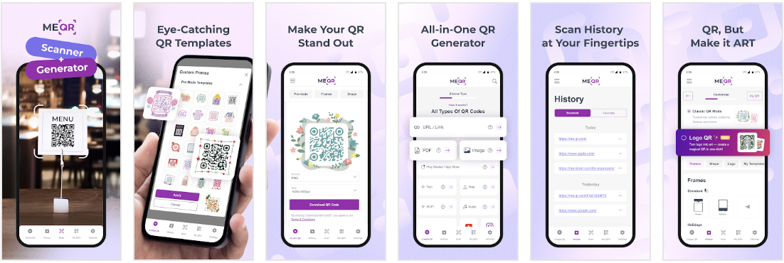
When users search for a scanner, they are directed to a page highlighting the QR code scanning feature.

When users search for a QR code generator, they are directed to the corresponding dedicated page.

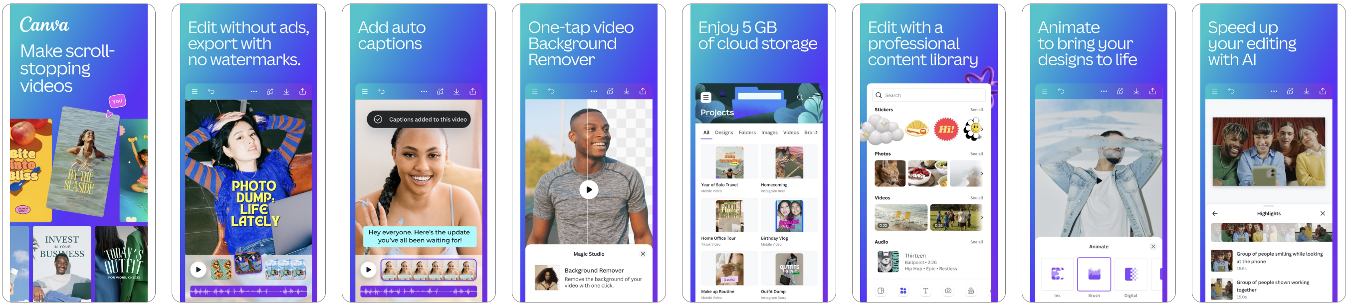
Pages have also been implemented for Canva: AI Video & Photo Editor.
By default, the creatives showcase the app’s full range of features.
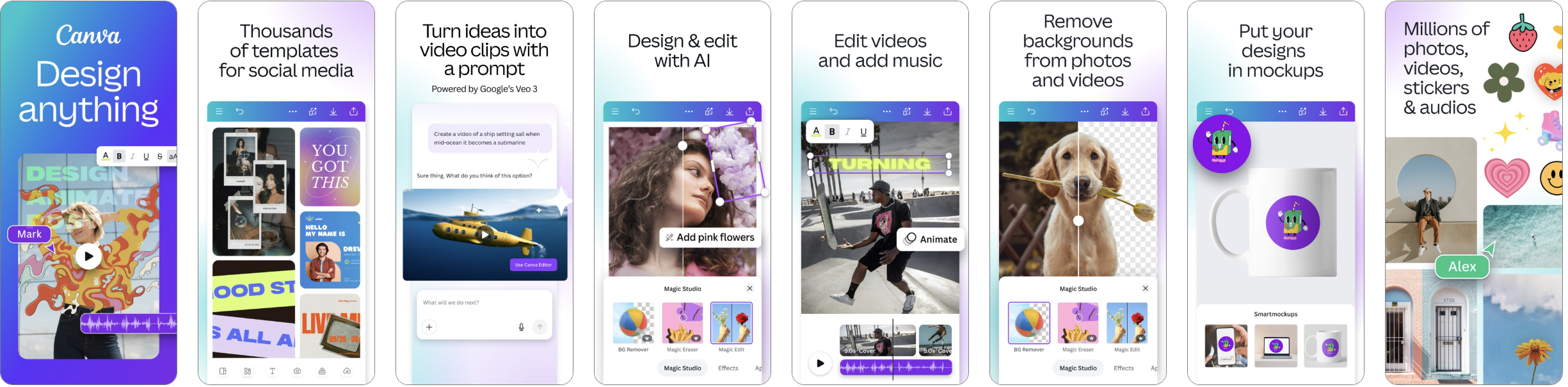
When a specific feature is requested, the pages are tailored accordingly and will differ based on the user’s intent.


A similar logic applies to the pages of Trip.com: Flight, Hotel, Train.
By default, users are directed to a general app page.

A page focused specifically on hotels.

A page focused specifically on flights.
.png)
A page focused specifically on purchasing train tickets.
.png)
It’s important to understand that working with general search terms and key features is only the first level of Custom Product Pages configuration. In reality, the same search intent can almost always be further refined and broken down:
In practice, CPP almost always follows a logic of gradual refinement: from a general intent to a more specific search term, from a function to a specific usage scenario, and from a scenario to the audience, motivation, or underlying user need.
This is a more precise version of a page, designed not for a general scenario but for a narrow, highly specific search intent.
While the first strategy addresses a general search term or a single major feature, this approach focuses on a more specific need:
Such a CPP should feel as if it were created specifically for this search term: screenshots, headings, and visual elements should match the user’s wording and expectations as closely as possible.
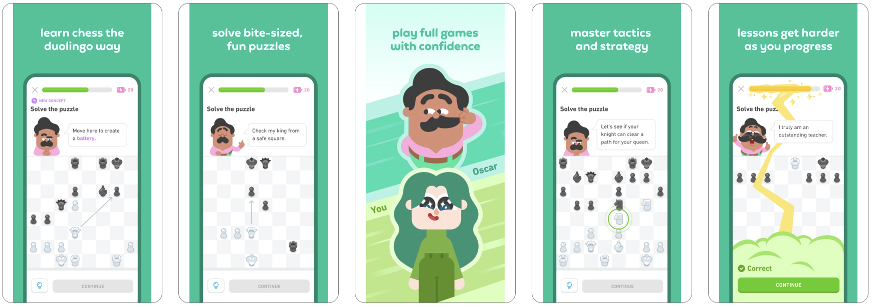
The Duolingo: Language & Chess case is an example of a page tailored to a narrow intent. It responds not to a general learning-related term, but to a specific need—learning chess. In this context, “chess” is not just a feature, but a distinct search scenario with its own user intent.
The app’s default page.
.png)
The page tailored specifically to the “chess” search term.
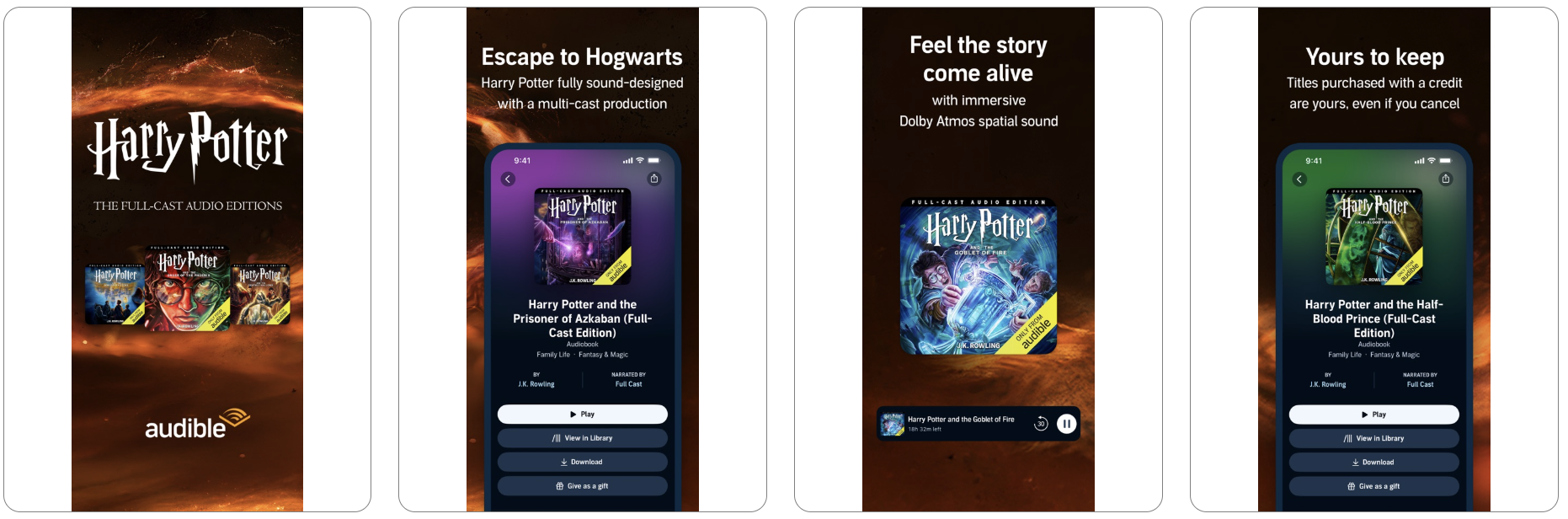
The audiobook app Audible: Audiobooks & Podcasts has implemented a similar approach. Their default page:

A page tailored specifically to audiobooks related to Harry Potter.
The Babbel - Language Learning app also has custom pages. Its standard page looks like this:

Here’s how the page tailored for learning Italian looks:

There are several ways to narrow down keyword clusters and better define user needs.
A page that showcases the same feature through different real-life contexts and motivations across various audience segments.
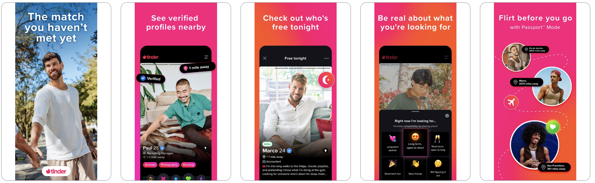
This is clearly illustrated by the example of Tinder. Separate CPPs can be created for:
The key point is not to change the product itself, but to adjust the presentation angle: one audience responds to themes of friendship and socializing, another to spontaneity and dating, and a third to travel and local connections.
A page tailored for brand-related search terms.

A page tailored for users looking to find friends.

A page tailored for a dating and matchmaking app.
From a technical standpoint, this strategy is not implemented through “age” or “interests” directly within the App Store, but through a combination of traffic sources and specific CPPs. In other words, separate pages and entry points are created for each audience—whether through Apple Ads campaigns with different keyword clusters, external advertising channels, or distinct creatives linked to unique CPPs.
Therefore, screenshots should not simply display the app, but visually connect with the target audience through context, tone of the headlines, key highlights, and real usage examples.
A strategy in which the same product is promoted using different psychological triggers: saving time, relaxation, learning, earning money, or achieving a specific outcome. In this case, the app’s functionality remains unchanged; what shifts is the reason the user chooses to install it.
This logic is implemented through separate CPP versions with different focuses and scenarios, each receiving its corresponding traffic—from search, ads, or external channels. As a result, users land on a page that matches not only their search term but also their underlying motivation.
Screenshots should reinforce the chosen theme:
For example, the home screen of the Flo Cycle & Period Tracker app demonstrates this approach.

A pregnancy tracking page.

A page for tracking periods.
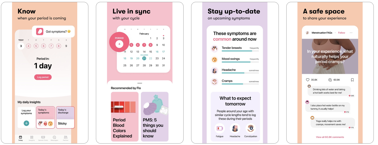
A page for tracking ovulation.

With this strategy, CPP is built not around the brand itself, but around a specific content format the user wants to see in the moment. This approach is especially effective in apps that combine multiple use cases within a single product. In one case, it may be chat; in another, stories, lenses, live content, discovery feeds, curated collections, or dedicated thematic sections.
From a technical standpoint, a separate CPP is created for each content type, with traffic distributed across different entry points—such as search terms, ad campaigns, or external sources. This ensures that users land directly on the version of the page that matches their interests and preferred content format.
Screenshots should clearly showcase this type of content so the page immediately answers the question, “What will I find here?” The result should feel less like a general app showcase and more like a targeted landing page for a specific interaction format.
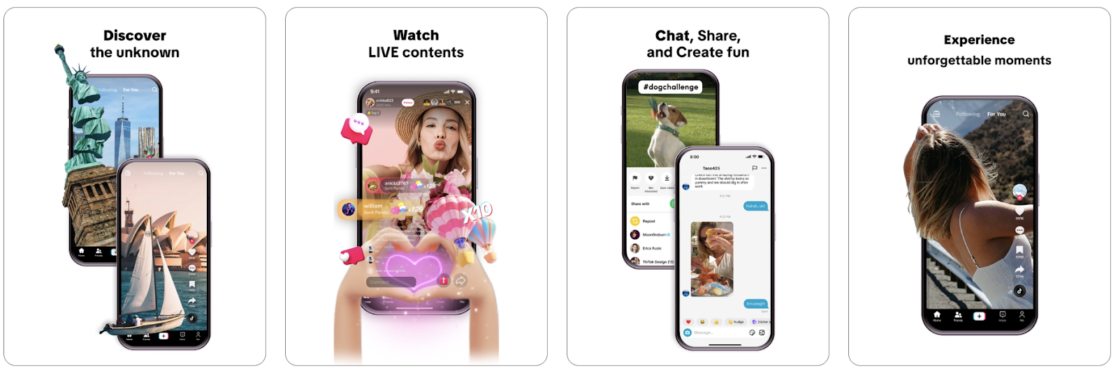
Example: TikTok. Default page.
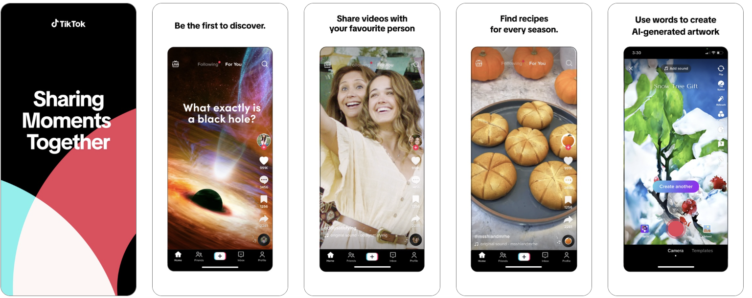
A page focused on communication, live content, and social interaction.
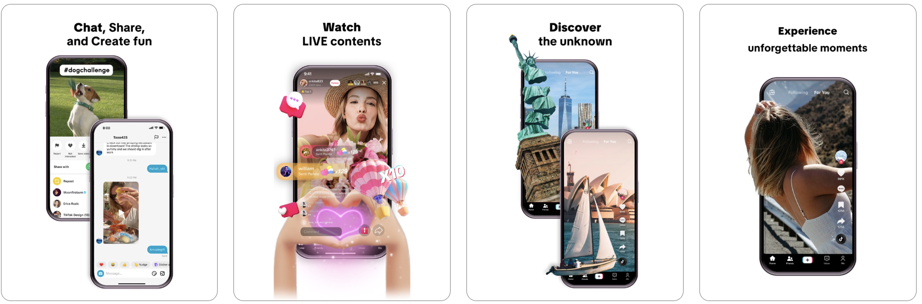
Creatives focused on discovery and on viewing content immediately, right here and now.
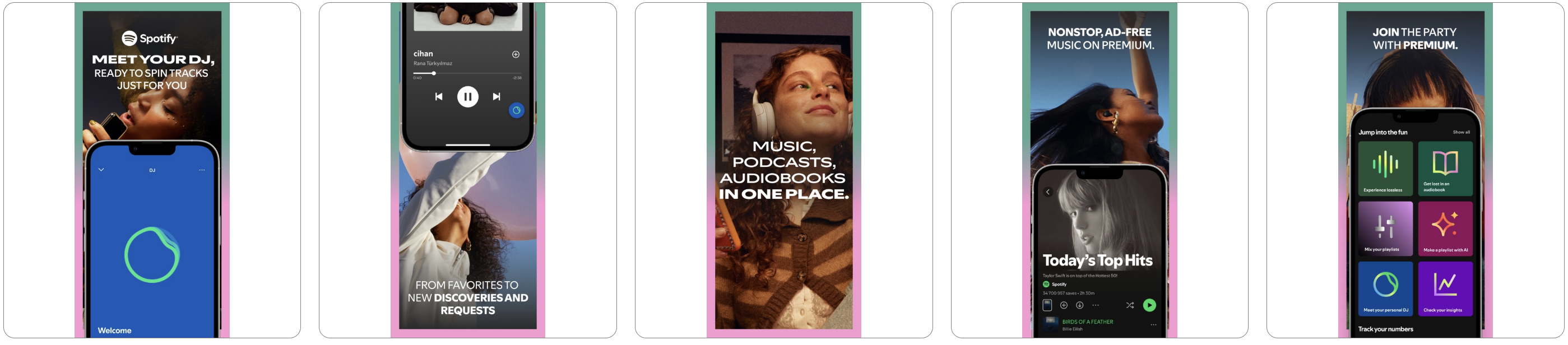
Example: Spotify. Default page.

Creatives focused on collaborative listening, jamming, and the premium experience.

Focus on personalization: DJs, recommendations, and new discoveries.
With this strategy, the page is built not around a feature, but around a specific problem the user wants to solve at the moment. The key is not just to showcase the product’s capabilities, but to quickly answer the question: what pain point does it remove from the user’s life:
The more precisely the CPP addresses a given pain point, the faster users recognize their own situation in it, and the higher the likelihood of installing the app.
It’s important not to confuse this strategy with installation motivation. Motivation reflects the desired outcome a person wants to achieve, while a pain point reflects what they want to eliminate. Therefore, in some cases, CPPs reinforce a positive promise, while in others they first highlight the problem that brought the user to the page in the first place.
From a technical standpoint, a separate CPP is created for each key pain point, and traffic is directed to it through relevant search terms, ad creatives, or external channels. As a result, users land on a page that immediately addresses their problem and presents a clear solution.
A strong landing page in this strategy follows a clear logic:
Screenshots shouldn’t just showcase the interface; they should systematically address user pain points by demonstrating that the solution is simple, intuitive, valuable, secure, and truly effort-saving. In this sense, targeting pain points is one of the most universal strategies, as it works effectively across almost any category—from delivery and finance to fitness, travel, education, and productivity.
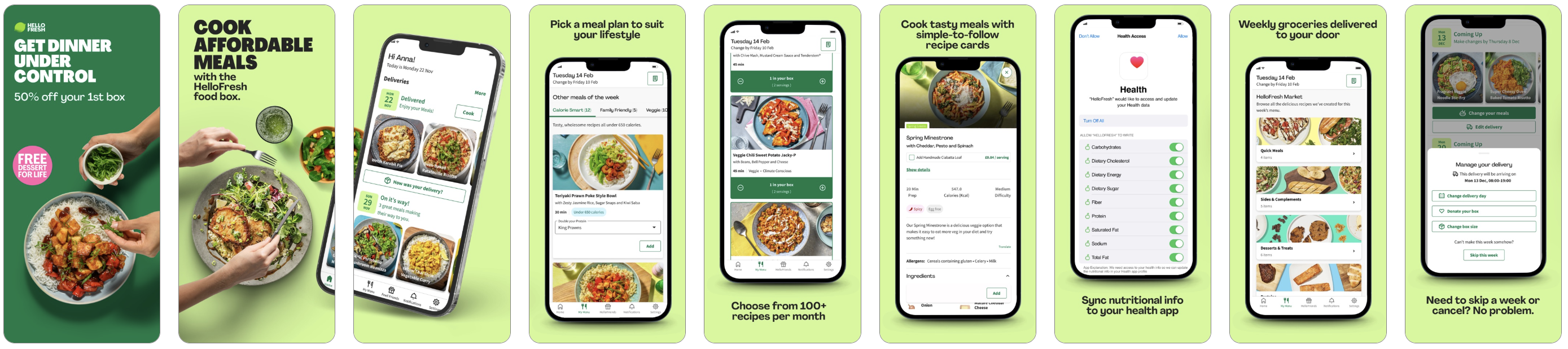
In practice, this looks like the following: for HelloFresh, the pain point is the complicated and tedious process of planning dinner, while for Rakuten, it’s the feeling of spending money without getting maximum value. In both cases, the CPP does not sell the product directly, but first addresses an unpleasant, familiar context for the user. That is precisely why these pages often convert better: they don’t just explain a feature, but help remove internal resistance.
HelloFresh’s default page.

A page addressing the user’s pain point — “Get dinner under control.”
Rakuten’s default page.
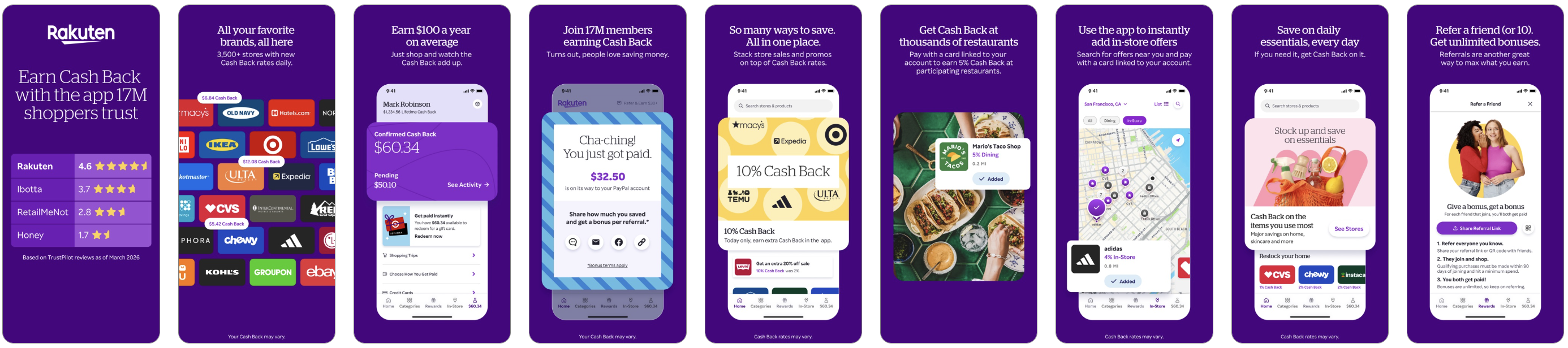
A page for a rewards program that addresses the user’s pain point — “Get Cash Back”.

However, custom pages can be created not only for search terms and user motivations.
Seasonal CPPs and CSLs leverage existing spikes in interest—such as holidays, sales periods, major events, local traditions, and limited-time offers. It’s important not only to design the page in a thematic style, but also to integrate the product into the current context so it feels like a natural part of the moment and helps users:
Screenshots should reinforce this context and immediately communicate the practical benefit the app provides in the moment, when users are already engaged in a seasonal or cultural scenario.
For example, the CBS Sports App: Scores & News. The regular app page:
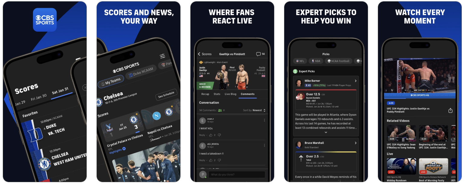
The Champions League page:


Or take Amazon Shopping. Its regular page looks like this:
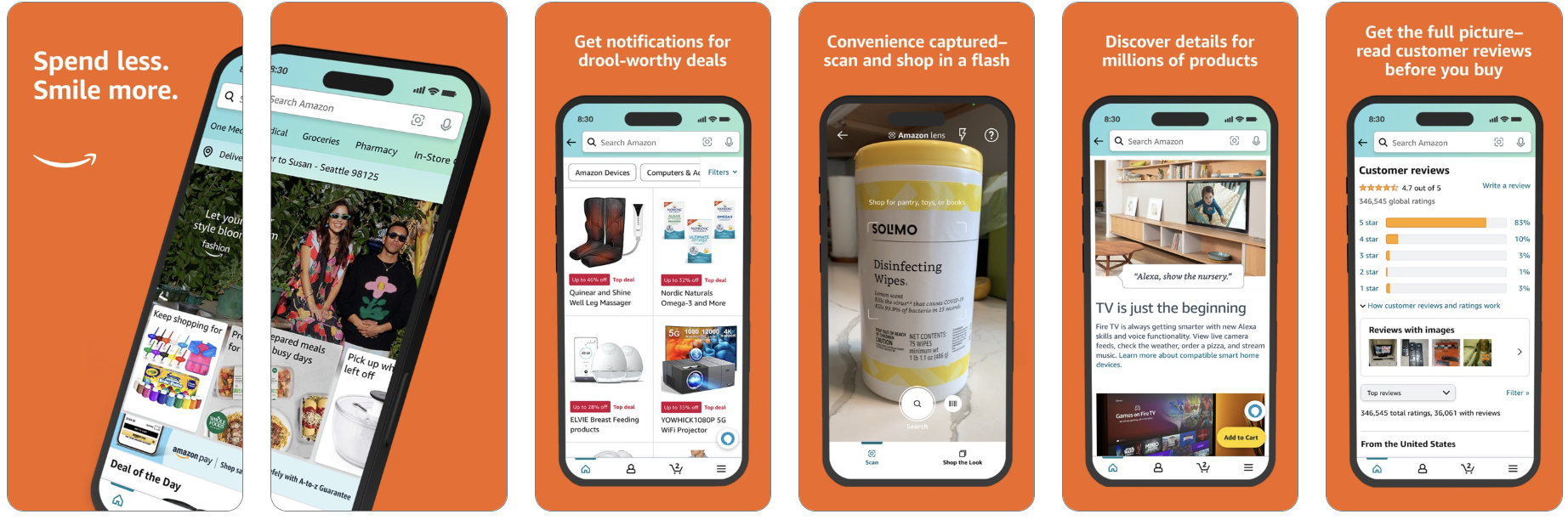
The Black Friday page features different creatives:

The RadASO team also developed seasonal pages for Auchan.
The default Auchan page and icon look like this:
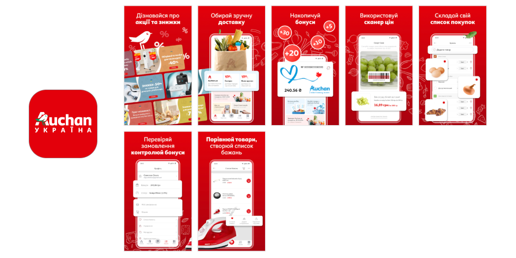
A New Year’s version of the page and icon.

This approach is based on a simple principle: each entry point has its own story. Users arriving from Apple Ads, search results, the Today tab, social media, or external campaigns may be at different stages of readiness. For this reason, the same page should not be used uniformly across all traffic sources.
Screenshots and text should align with the traffic source context to avoid breaking the connection between the initial promise and the landing page.
For advertising campaigns, these CPPs are especially effective because they reflect the user’s search intent in both visuals and meaning. If a user searches for “scan any doc,” “text recognition,” “one-tap export,” or “perfect PDFs instantly,” they should immediately see that exact scenario on the page—not a general overview of the app.
The right creatives align with the user’s existing expectations, quickly confirm they are in the right place, and present a concrete outcome rather than an abstract feature.
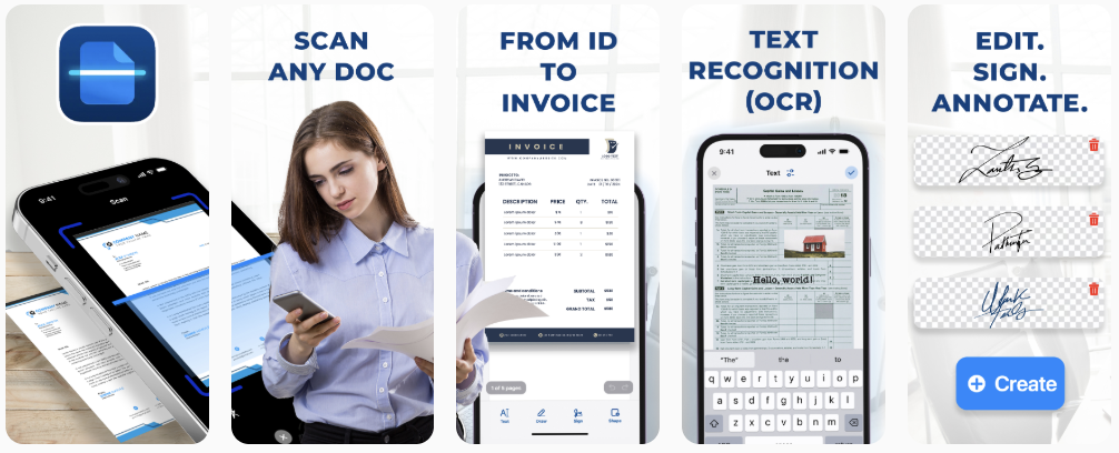
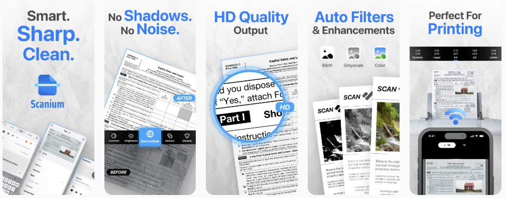
In the example of PDF & OCR Scanner – Scanium, different versions of screenshots were created for different keywords:
The more precisely the ad copy reflects the promise of the search term, the stronger the connection between the ad and the landing page, and the higher the likelihood of conversion.
Default scanner page:
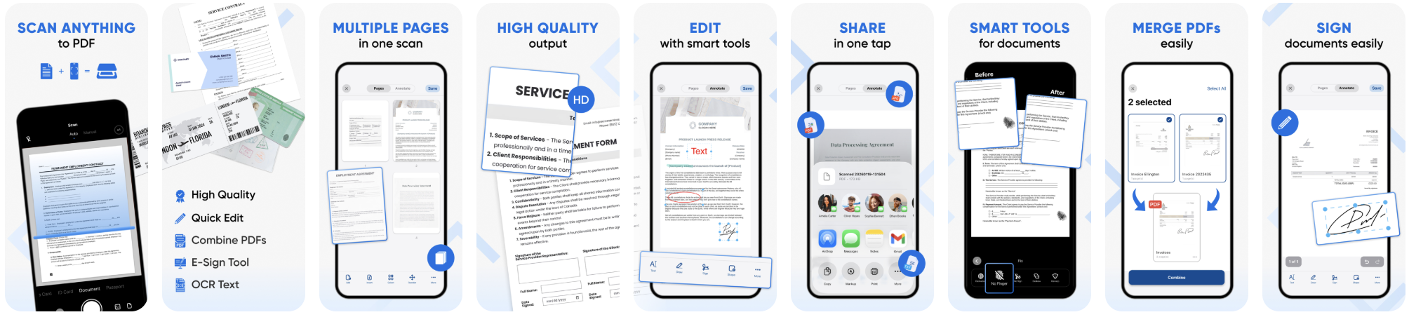
CPP for paid campaigns:

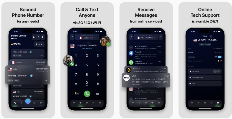
In this example of the eSIM Plus: Second Phone Number app for travelers in different countries, different versions of the page highlight different needs. General page:

CPP for ad campaigns: the second number is highlighted in the first screenshot. This makes the landing page significantly more effective for paid traffic, as users immediately see the same promise they encountered in the ad when searching for “second phone number.”
This isn’t about copying a competitor’s brand, but about creating a well-crafted page for an audience that is already comparing options. The goal of this CPP is not to imitate another identity, but to demonstrate how your product performs better in a specific scenario:
This format works particularly well for brand- and competitor-related search terms, when users are already close to making a decision and are simply choosing between several options.
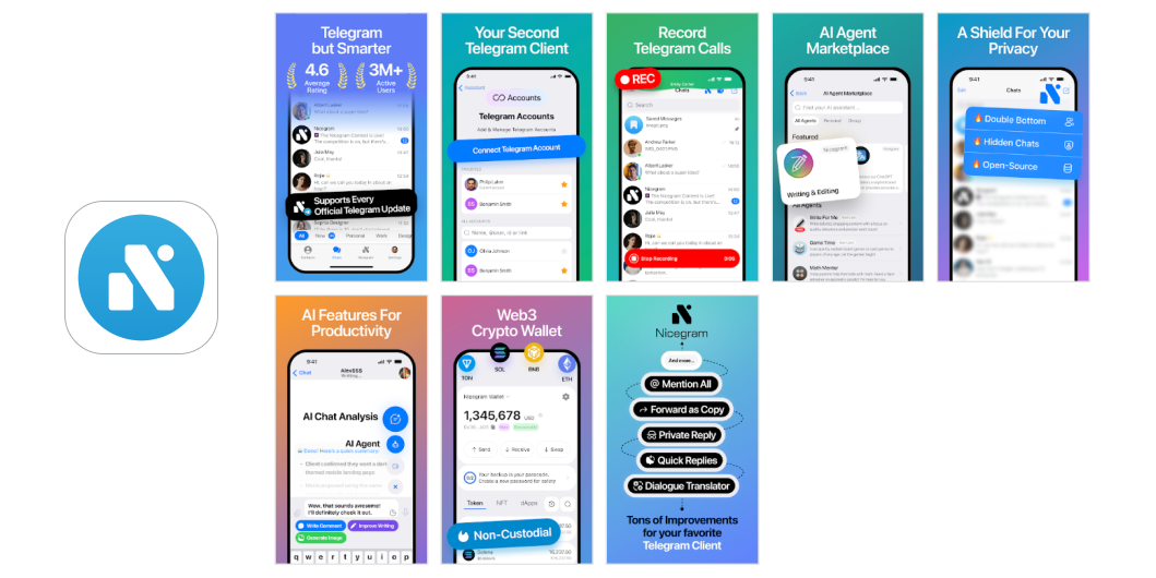
In the example of the Nicegram app, the RadASO team implemented classic CSL use cases for branded and competitive search terms. The custom page targets users who are already familiar with Telegram and are considering alternative solutions. CSL does not attempt to replace or replicate the original product, but instead positions itself as an enhanced option tailored to specific use cases.
Standard page and app icon.

Page and logo for competitive comparison. The key idea is: “Telegram, but with enhanced capabilities.” This is immediately evident on the first screen and then gradually reinforced through specific advantages.
An aggressive strategy in which a page deliberately uses visual and semantic cues familiar to the user to immediately trigger recognition and reduce friction in decision-making. The goal is not to replicate another brand, but to create a strong sense of familiarity—through similar presentation logic, a recognizable usage scenario, and alignment with the user’s existing expectations.
This CPP/CSL strategy works particularly well for competitive and brand-related searches, when users are already comparing options and are more likely to make a decision quickly if they recognize a familiar pattern that offers additional value.
Visually, this strategy is usually built around the “same, but better” effect:
This is precisely why such pages often look more assertive and sales-oriented: they don’t explain the product from scratch, but instead immediately tap into the user’s existing expectations and try to capture their attention at the moment of comparison.
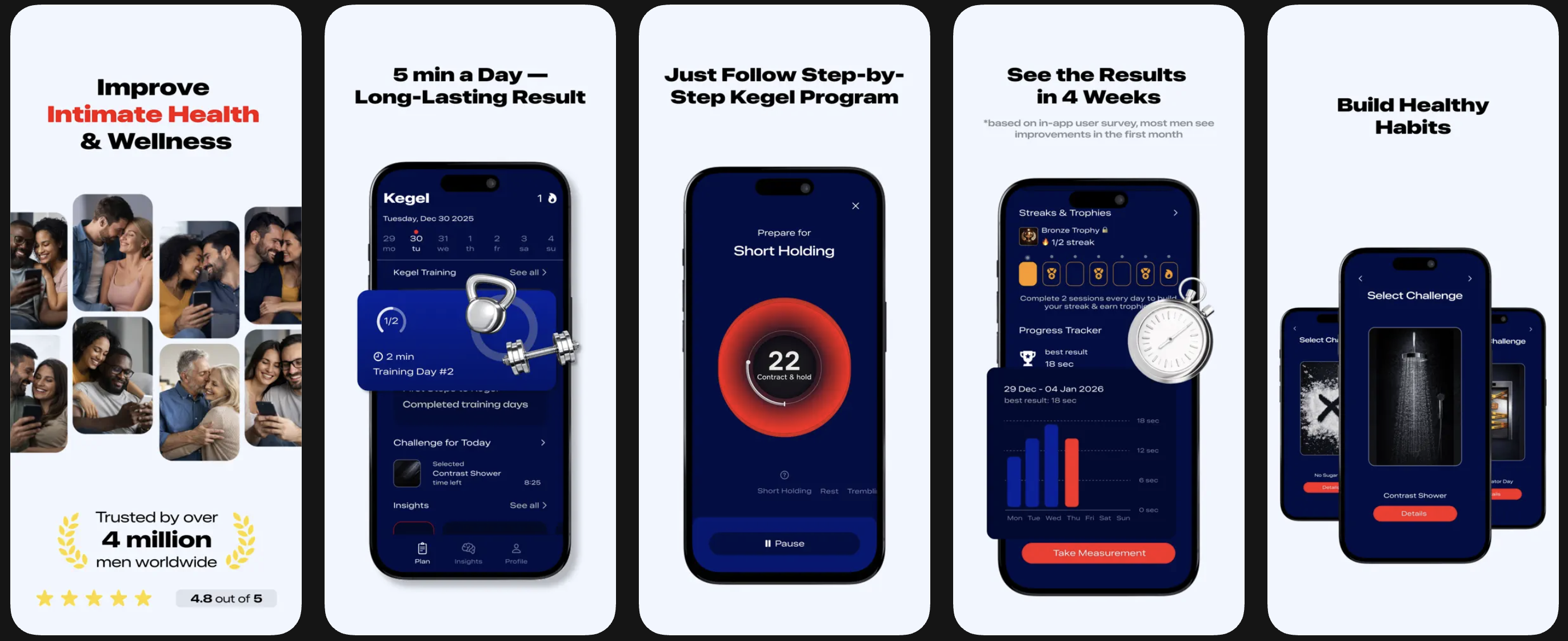
An example of the original app: Dr. Kegel: For Men's Health.

Competitor apps do not directly copy the brand, but closely mirror its presentation through screenshots, headline tone, and the structure of their value propositions. As a result, they appear as a familiar and understandable alternative within the same category:
Competitor app: Kegel exercises trainer.
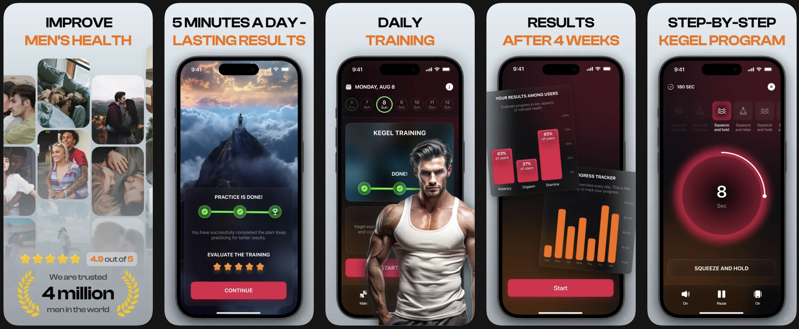
Competitor app: Kegel Exercise: Men's Health.
A strategy in which the same page is tailored to a specific market:
This goes beyond simple interface translation and becomes a localized presentation of value: in one country, discounts may be most effective; in another, delivery speed; in a third, security; and in a fourth, format availability or a familiar usage pattern.
The goal of this strategy is that users should not perceive an “international version of the app,” but rather a page that feels specifically designed for their market. This is especially important for marketplaces, travel, ride-hailing, finance, delivery, e-commerce, and any apps where behavior and expectations vary significantly by region.
Using AliExpress - Shopping App as an example, a non-localized page looks like this:
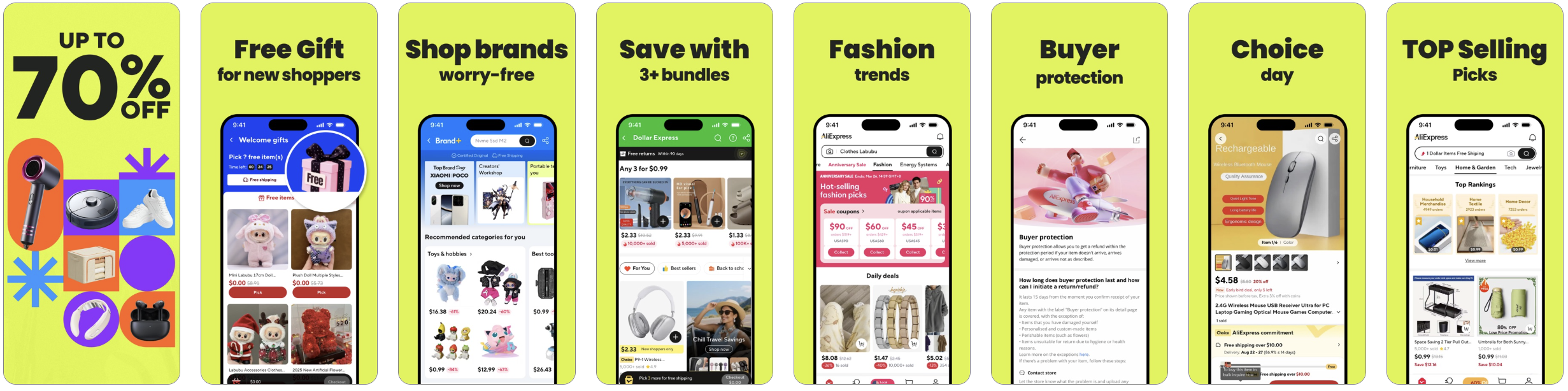
Page for Germany:
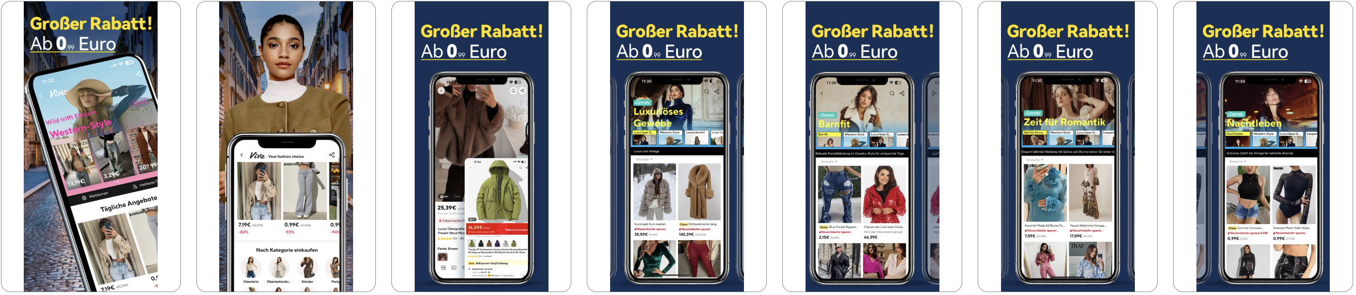
Page for Spain:

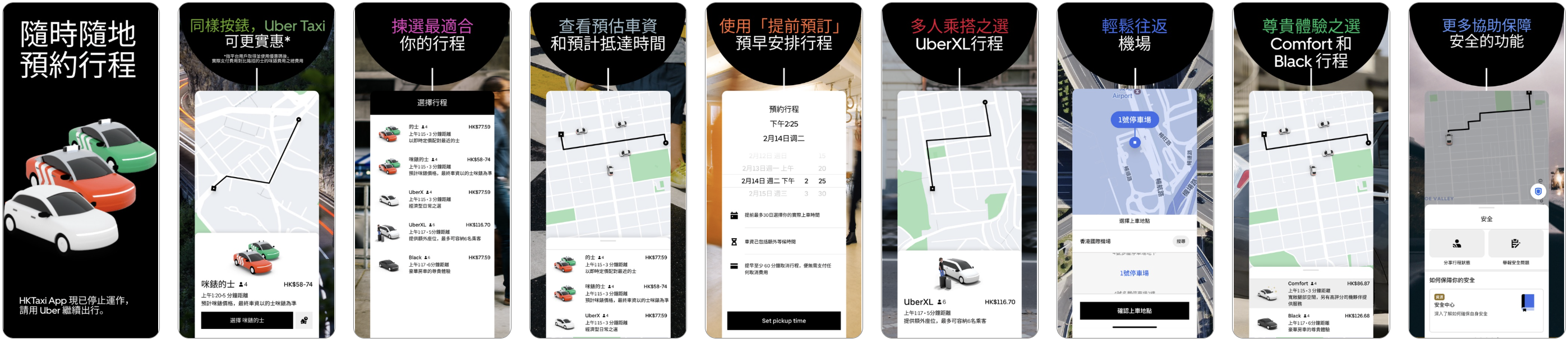
Uber - Request a ride case study. Default page:

Page for the UK:

Page for India:

Page for Hong Kong:


Custom Product Pages and Custom Store Listings perform best when each page version reflects not just the product, but the user’s specific intent. The more precisely the search term, motivation, audience, and visual scenario in the screenshots are aligned, the higher the likelihood of conversion.
Therefore, a strong CPP is never a single universal page, but rather a set of targeted landing pages tailored to different entry points, needs, and stages of purchase readiness.


.avif)