
The mobile app market is saturated with options, and downloading an app is only the first step toward success. The real challenge begins next: keeping users engaged and preventing them from pressing the “Delete” button.
User churn is inevitable, but by following these steps, you can significantly reduce uninstall rates and build a product that users want to keep.

Before talking about solutions, it is important to understand the reasons. Users rarely analyze their decisions — they act intuitively. If an app fails to deliver value or problems arise during use, they simply delete it.
The most common reasons users delete apps include:
All these factors share a common root problem — the user does not have a positive initial experience. In many cases, the first few minutes of use determine the fate of the app.
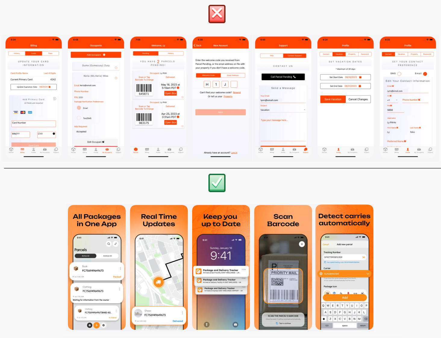
The user has installed your app — what’s next? How do you show that it meets their needs and deserves a place on their phone?
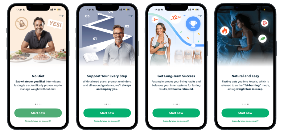
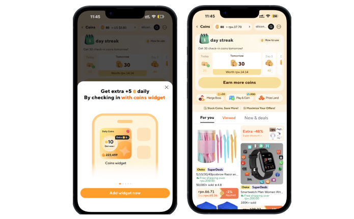
This is where onboarding comes in — the process of introducing users to the app. It’s a guided experience where people discover the main features, learn how to use the product, and personalize it to fit their needs.
The main goal of onboarding is to help users perform their first action as quickly as possible and see the result. When people immediately understand the value of a product, they are far more likely to keep using it.
For onboarding, focus only on the advantages that truly differentiate your app from competitors and clearly demonstrate its value to the user.
Onboarding is necessary in two situations:
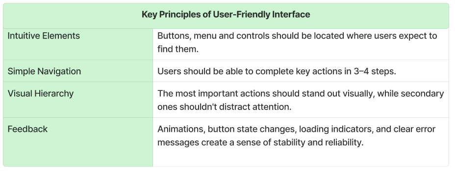
What makes onboarding effective?
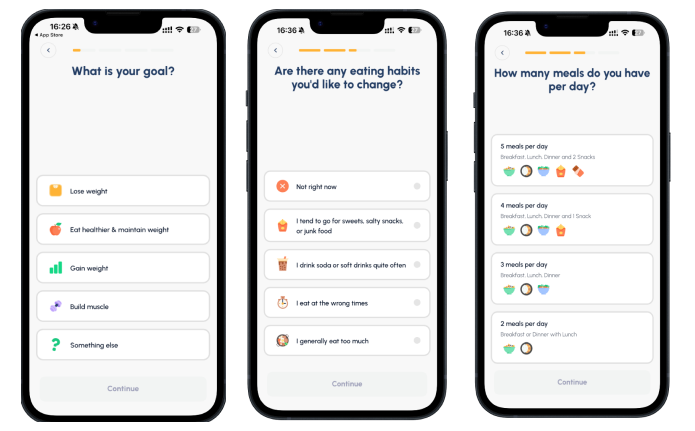
Onboarding is also the first dialogue between the app and the user. At this moment, people are more willing to answer questions—if they understand why they are being asked. Without interface personalization, every user sees the same thing: identical screens, identical offers, and identical scenarios. But users have different needs.
As a result:
This creates the feeling that the app is “not for them.” When the benefits aren’t immediately clear, deleting the app becomes only a matter of time.
When an app immediately adapts to the user’s needs, people are far more likely to have a positive experience and see a personalized interface right after completing onboarding.
A few simple questions at the start help to:
If the interface appears clear and logical after onboarding, users can quickly move on to taking action. However, when navigation is complex, elements are unclear, or the path to the desired result is overloaded, even a well-explained product can lead to frustration.
After onboarding is complete, you only have a few seconds to reinforce a positive impression. At this point, the user should immediately understand:
An intuitive interface helps users quickly achieve their goal, get their first result, and feel in control. This creates a positive emotional response that directly influences their willingness to return to the app.
Users have little patience for slow or unstable app performance. Long loading times, freezes, crashes, or excessive battery consumption create frustration within the first few minutes of use. In most cases, this irritation leads to a simple solution: deleting the app from their device.
Performance is a fundamental expectation. Even the best UX/UI design and most useful features won’t save a product that runs slowly or is unstable.
That's why performance optimization should be a priority at all stages of app development. It covers:
Regular testing helps identify errors, crashes, and technical issues before users encounter them. Stable performance builds trust and minimizes the chances of scenarios that could lead to app abandonment.
In the digital world, users expect instant responses. If screens take too long to load or the app responds slowly to actions, attention is quickly lost. Optimizing startup time, data loading speed, and key workflows directly impacts user retention.
Google Play provides guidelines on startup time and overall performance optimization through Android Vitals.
These guidelines refer to Time To Initial Display (TTID) — the time it takes for the first UI frame to appear after launching the app.
Google Play does not automatically block apps for slow startup, but metrics from Android Vitals can impact visibility, ratings, and discoverability if performance thresholds are exceeded.
Unlike Google Play, the App Store does not specify exact load time requirements. The main performance expectation is that the app functions correctly without errors or freezes and operates as intended according to Apple’s guidelines.
App size directly impacts download conversion and user retention. Platforms also impose technical restrictions, which should be considered during development.
According to Google's official documentation, the platform sets the following limits:
Android Package Kit (APK) is the standard file format used to distribute and install applications on Android devices.
Learn more about app size optimization in the app creation guide.
The App Store sets the following limits:
High performance directly influences user trust. When an app runs quickly, reliably, and without unexpected issues, users are far more likely to return and far less likely to delete it.
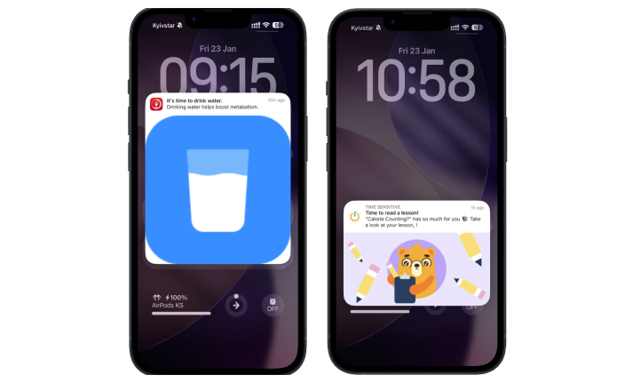
Even if a user is satisfied with an app, it doesn’t guarantee regular use or prevent deletion. In the daily flow of life, apps are easily forgotten—especially if there’s no clear reason to return. At this stage, mobile push notifications become a key retention tool.
Mobile push notifications are short messages that appear on a smartphone screen without the user having to open the app.
Relevant push notifications, personalized in-app messages, and well-designed email newsletters can reignite user interest, especially when they provide a clear reason to return—such as useful content, a new feature, or a limited-time offer.
The most effective communication is always user-centric. It’s crucial to understand when, how, and why users are willing to receive messages and to use this knowledge to create relevant, timely interactions. A message delivered at the right moment with the right content can transform a long period of inactivity into a deliberate return to the app.
Recognizing user activity is key to building an emotional connection with your product.
Small but thoughtful rewards—like a registration bonus, recognition for regular use, or milestones achievements—help create a positive first impression and reinforce desired behavior. These mechanics show users that their time and engagement are valued.
Referral programs are another powerful tool. When users are rewarded for recommending the app to friends, everyone benefits: new users join with built-in trust, and existing users feel involved in the app’s growth. This not only boosts engagement but also strengthens users’ sense of belonging to the brand.
Exclusive opportunities for loyal users add extra value. Examples include early access to new features, personalized bonuses, special offers, or small gestures on meaningful occasions—such as an app usage anniversary or reaching a milestone in activity days.
The primary goal is to build long-term relationships, not just one-time interactions.
When users consistently feel that their loyalty is recognized and rewarded, they are more likely to return, use the app frequently, and recommend it to others.
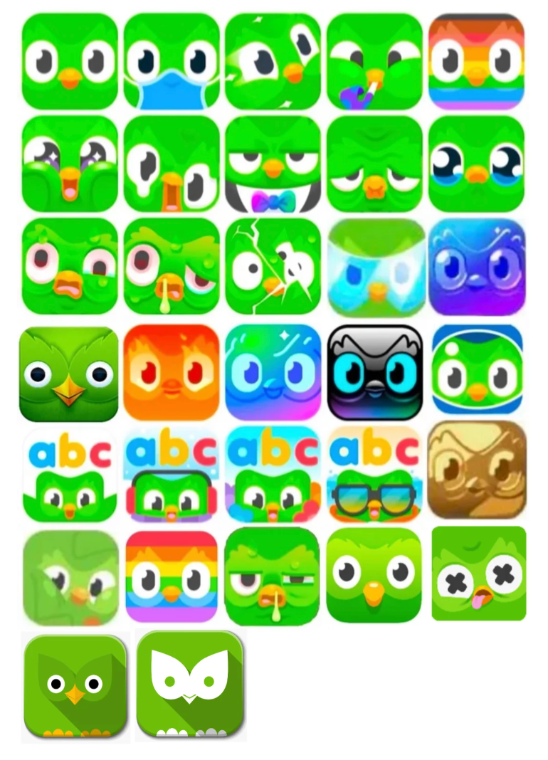
Another way to capture user attention is by changing the app icon on the device.
An app icon is more than just a picture on the home screen. It serves as a daily reminder of your product—a point of contact users see dozens of times each day. The challenge is that over time, the same icon can become “invisible,” as the brain stops noticing it among other interface elements.
Why changing the icon on the device works:
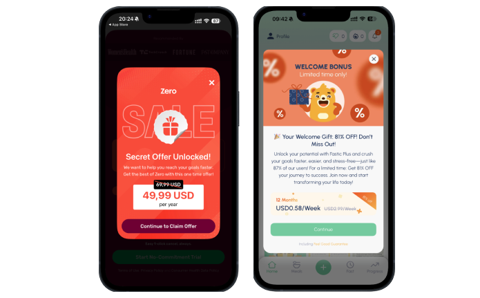
Text optimization impacts not only downloads but also user retention. When descriptions, screenshots, or metadata mislead users or set false expectations, the outcome is predictable: disappointment and app deletion.
Here are the most common ASO mistakes:
Using phrases like “FREE Best #1 Fitness App Ever — Download Now!” or “TOP FREE Game 2025 — Best App!!!” fails to convey the app’s real value. Users install the app without understanding what it offers and quickly become disappointed. Additionally, app stores may even block apps for excessive use of terms like “#1” or “FREE” in descriptions.
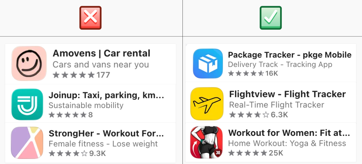
Literal translations of screenshot text, without proper adaptation, make the app feel low-quality or “foreign.” Users quickly sense that the product isn’t meant for them, even if its functionality is excellent.
Using irrelevant keywords in visible metadata attracts the wrong audience. For example, a video editor app with keywords like “music,” “games,” or “dating” draws users with mismatched expectations. As a result, users install the app, fail to find the features they need, and quickly uninstall it.
A similar problem arises when the app icon and store screenshots fail to accurately represent the product or mislead users about its features. Such inconsistencies harm retention, reduce conversion rates, and negatively impact the overall perception of the app in the store.
The mobile app market is constantly evolving. Competitors continuously update functionality, experiment with interfaces, and test new methods to attract and retain users. If you don’t keep up, even a product that is successful today can quickly lose relevance.
When analyzing competitors, focus on the following factors.
Users rarely compare apps consciously, but they do so intuitively. Features or workflows that are quick and convenient in one app become the expected standard in others. Functional analysis helps identify which scenarios and features are now standard in your niche and which create unnecessary friction. This reduces user frustration, simplifies the journey, and lowers the risk of uninstalls.
Regular competitor analysis provides an honest evaluation of your product. It helps you see where your app lags behind the market, which basic features are missing, and where you can offer a better or simpler experience. Without this external perspective, teams often invest in internal ideas with little real value to users, while overlooking critical gaps that drive churn.
Functional analysis reduces the risk of investing in features that are no longer relevant or in demand. It enables timely responses to niche changes, helps maintain product competitiveness, and supports strategic development grounded in real market dynamics. For businesses, it provides a way to focus resources on initiatives that truly impact retention, loyalty, and growth.


.avif)