Improving conversion is easy when a product has weak visuals. But what do you do when the store page already looks good and there are no obvious issues? That was exactly the situation we faced when we began working with eSIM Plus — a service that provides mobile connectivity without the need for a physical SIM card.
In this case study, we explain how analysis, strong hypotheses, and a series of experiments helped us identify growth opportunities, enhance visuals, and achieve a measurable increase in the conversion rate from page views to installs.
eSIM Plus is a service by Appvillis UAB that has been helping people around the world stay connected to mobile networks and the internet since 2019 — all without a physical SIM card, thanks to embedded SIM (eSIM) technology.
Increase the conversion rate from app page views to installs on Google Play.
With this in mind, we built our strategy around three key stages:
To improve conversion, we first needed to define which graphics testing format would provide broad reach and reliable insights.
We considered using Custom Store Listing — allowing us to create alternative app page versions tailored to different user groups.
However, this approach wouldn’t achieve the needed effect: the available traffic and search queries on Google Play were too broad, mostly centered on “eSIM.” It wasn’t possible to segment the audience in a way that would yield clear, actionable test results.
Therefore, we decided to test graphics directly — through A/B-tests on the main Google Play page.
This allowed many users to see the new variations and provided us with statistically meaningful data quickly.
The original icon had a modern look to it but contained textual elements of relatively short proportions that easily got lost among other apps in the store.
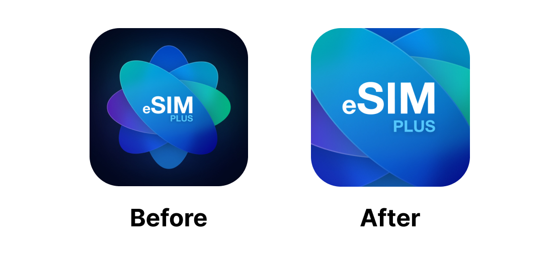
We preserved the brand style but enlarged the logo, making the text more noticeable and readable in search results, while the icon itself also looked cleaner and less cluttered with details.
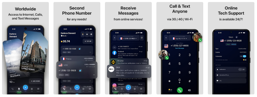
The gray background with dark imagery looked neat, but we identified several opportunities for improvement:
Screenshots before:
Screenshots after:
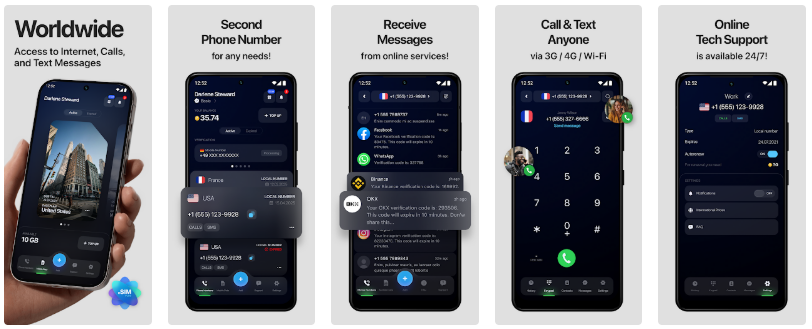
In the updated version, we highlighted what matters to the user in the first few seconds:
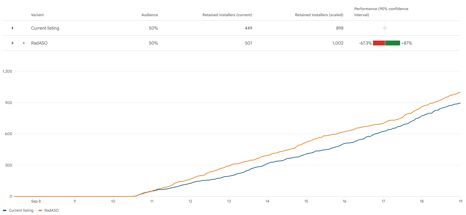
To assess the impact of each visual element, we ran two A/B tests — one for the icon and one for the screenshots.
Google Play split the audience 50/50, showing users either the original page or the updated version. Conversion was measured by the number of installs following a page view.
The updated icon consistently outperformed the original, ultimately driving a 6.15% increase in conversion by the end of the test.
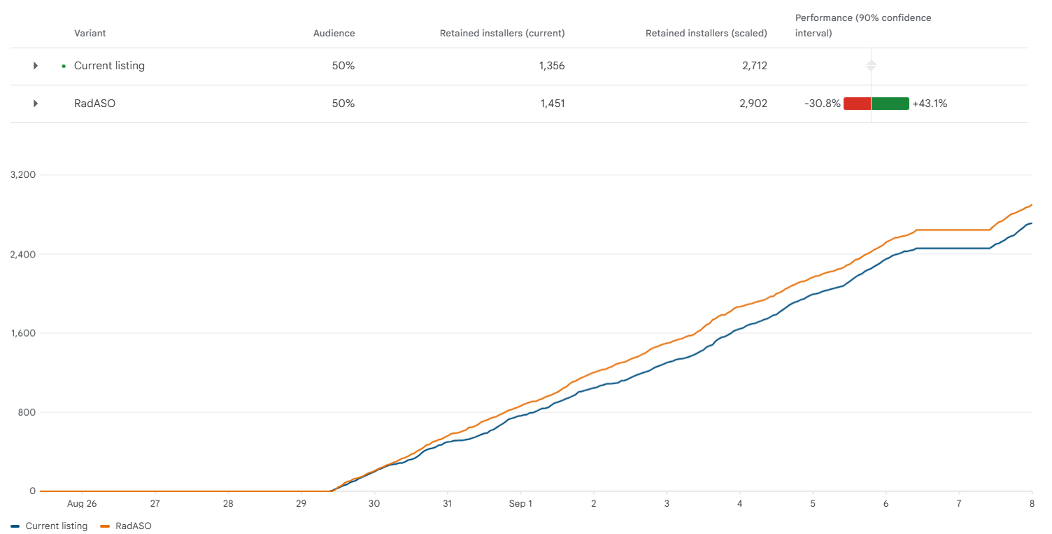
The updated screenshots also delivered consistently better results, outperforming the original by 9.85% by the end of the test.
To assess the true impact of the updated visuals, we compared conversion rates in the Explore channel — organic search from non-branded queries, where visuals and messaging play a key role in user selection.
We analyzed two equal-length time periods:
Final conversion growth: +1.63%
There’s an unwritten rule in ASO: to achieve a noticeable conversion uplift, the new visuals often need to be significantly different from the originals.
The eSIM Plus case shows that this is not always the case. Here, targeted yet thoughtful adjustments delivered measurable results: strong primary messaging, simplified layouts, a more impactful first screenshot — and that was enough to boost conversion.
The key is to not fear, but embrace revisiting your visuals, along with continuously validating hypotheses, and avoiding making decisions solely based on taste or habit. Sometimes, small improvements combined with systematic testing can deliver the results typically expected from a full redesign.


.avif)