You have a prospective app and are ready to conquer markets, but you lack a key factor to get users to download it massively. Sound familiar?
In this article, the RadASO team shows how in-depth analysis, creative solutions, and a well-thought-out strategy can achieve such results. We will explain how graphics optimization in the Shkaf app (digital wardrobe) has radically changed its success in the market. You will find insights from ASO experts, a detailed description of the key optimization steps, and results that prove it.
Even more insights from ASO & UA pros in ASO Busters on Discord!
Shkaf is a digital wardrobe that allows you to collect your entire clothing in one app. You can also create and plan fashionable looks for everyday or specific events. Get inspired by other people's outfits or show your friends yours. Categorize clothes and see statistics by color, brand, season, etc. in your wardrobe.
Expanding the app's coverage to new foreign markets and increasing conversion from impressions to downloads. The team worked with both text and graphic ASO to achieve this goal. In this case study, we'll talk about the second component in more detail.
Graphic optimization in RadASO is based on the CRO Loop (Conversion Rate Optimization) method. We will describe this strategy in the key stages below.

The analysis showed that graphics in the niche are highly varied. There is no single color style. However, it has become clear that applications that combine interesting graphic components with intuitive and clear demonstration of functions stand out from the crowd.
The team collected the most popular graphic elements related to the niche on competitors' icons: wardrobe elements (hangers, wardrobe) and clothes. They were used to create a new icon for the client's brand.
The RadASO team generated several variants of icons and screenshots for both sides.
Below are the graphics (icon and screenshots) before cooperation with the RadASO team.
For the App Store:

For Google Play:

New graphics from the RadASO team.
For the App Store:
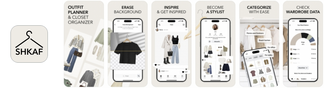
For Google Play:
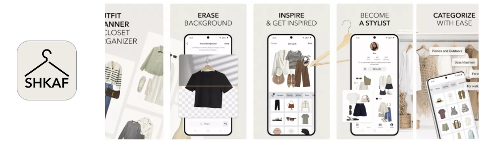
Note. The functionality of the application in the App Store and Google Play differed slightly. That is why we have depicted only the relevant features for Google Play in the screenshots.
1. The visual test lasted 41 days. For the US country, it was carried out according to the 50/50 parameters - we distributed traffic between the two options. The total sample of users was 28,371. It showed that the new screenshots would increase the app's conversion rate by 16% with a *Confidence of 99.9%.
*The Confidence parameter shows how confident the algorithms are in the results of a particular option.

Where,
Note. In the App Store, screenshots have a greater impact on conversion than icons, as they are visible in search results. In Google Play, the situation is the opposite - the icon has a greater impact on conversion because screenshots are visible in search results only if the user searches for branded search terms.
In our case, the icon is more important because the brand is still unknown in Western markets. Users find the app mainly by general search terms.
2. The RadASO team developed the concept of new icons in light and dark colors and tested it. As a result, the new light-colored icon also showed a +2.87% conversion rate improvement.
Note. According to RadASO's experience, when planning A/B tests, it is better to test an icon if the app receives 300+ installs/daily. With 50-100 installs/daily, it is better to test screenshots. In this case, the test will not last for months.
In our case, there were not enough impressions and installs/daily for a full-fledged test of the icon. Even though the Confidence of the winning light icon was only 1.1%, we made a strategic decision to use it because the letter “Ф” is not clear in Western markets. Also, it was a better stylistic fit for the new set of screenshots.

Where:
3. As a result of the new icon and the launch of the A/B test on screenshots, the growth and increase in organic search installs for the US have increased 4 times.

During the same period, the team made changes to the app's metadata. In combination with the new graphics, this also led to an increase.
1. In Google Play, the results are displayed as a conversion rate range (green and red ranges in the figure below). In Google Play A/B tests, the most likely conversion change will be in the middle of this range, i.e. the average between two values of the same range.
In our case, the change in conversion is (14,3+(-3,3))/2= +5,5% with the Confidence 95%.

Where,
The RadASO team increased conversion to downloads by 16% and installs by 4 times (+400%) due to an in-depth approach to working with graphics, and in-depth analysis of the client's app and the niche in general. The results showed that our hypotheses for screenshots and icons in both tables worked better than the current graphic options. This led to the corresponding growth.

One of the main tasks the RadASO team faced was to improve the conversion rate from view to download. After identifying the problem and considering various options for solving it, we achieved results - the number of app installations increased significantly. Brainstorming within the RadASO team was a key step.
We proposed hypotheses and new ideas for improving screenshots and icons. They were eventually used and got the expected result in combination with textual ASO. We recommend further experiments to achieve even better results.


.avif)